
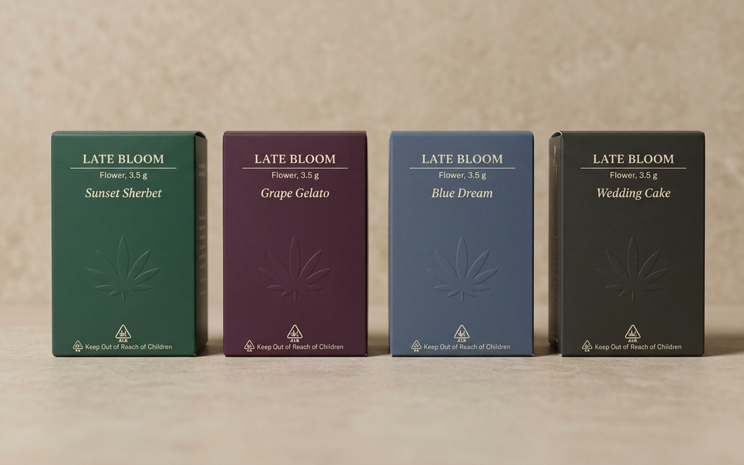
Cannabis brands have always had to design for an adult audience. What changed this month is how clearly California now spells out what that means. On August 31, 2026, Governor Newsom signed Assembly Bill 2249, a packaging and marketing standards bill authored by Assemblymember Jacqui Irwin, and the new definitions become operative on January 1, 2028. Details on the bill are covered by GreenState and in a plain language rundown from CannaShield.
California is the largest legal cannabis market in the country, and the rest of the industry tends to follow where it goes. Whether you sell in California or not, the direction is clear: packaging that reads unmistakably adult, with the brand carrying the shelf presence that cartoons, candy references, and fruit imagery used to carry. For brands that think of packaging as a design asset rather than a wrapper, that is a real opportunity. Here is how to approach it.
What the new standard actually covers
Proposition 64 already prohibited cannabis packaging and marketing that is attractive to children, including cartoons. What AB 2249 adds is specificity. The updated statutory definition names cartoons, sweets and candy references, children’s entertainment, certain typography choices, imitation of existing consumer products, and fruit imagery as elements that can make a package attractive to people under 21. The operative date of January 1, 2028 gives operators a little over a year to review artwork, SKUs, and marketing before the definition takes effect.
Read that way, the law is less a list of rules and more a description of a design lane. Everything outside that lane is still open: color, structure, finish, typography built for adults, photography, pattern, storytelling, and the tactile experience of the package itself. That is a lot of room to work with.
Let the brand carry the shelf, not the imagery
The strongest cannabis packaging we see at CannaCarton was never leaning on a cartoon mascot or a candy lookalike in the first place. It leans on a clear brand system: a confident logo, a consistent color story, and a layout that reads the same across jars, tubes, pouches, and cartons. When that system is doing the work, the package looks premium and adult on any shelf in any state.
A good starting point is to audit every SKU against three questions. Does the visual language read as an adult product from six feet away? Does the typography feel like a spirits, coffee, or skincare brand rather than a cereal box? Would the design still make sense if every illustration were removed? If the answer to all three is yes, you are most of the way there. If not, our in house design team helps brands work through exactly this kind of refresh, from the first mood board to press ready files.
Finishes give you shelf impact without pictures
When imagery steps back, finishing steps forward. Foil stamping, embossing, soft touch coating, spot gloss, and metallic labels create shelf presence through light and texture rather than subject matter. A deep matte carton with a single foil stamped logo reads as premium to an adult shopper and gives a budtender something worth pointing at. We walked through each of these options and how to layer them without overdoing it in our guide to premium print finishes.
Finishes also travel well. A brand system built on structure and texture instead of artwork is easier to keep compliant across multiple states, because the elements that vary by market are usually the required text and symbols, not the core design.
Typography and color are your new illustrations
Type is one of the elements the new definition calls out, which makes it worth choosing carefully. Clean serif and sans serif families, generous spacing, and clear hierarchy signal an adult product immediately. Playful bubble letters and display fonts borrowed from kids’ media do the opposite. The good news is that great typography is one of the least expensive design investments available. It costs nothing extra on press.
Color works the same way. Rich, muted, or sophisticated palettes read adult. Strain names can still be expressive, and a jar can still be beautiful. Think of the shelf at a good wine shop or a specialty coffee roaster. Nothing there is trying to look like a toy, and all of it is trying to be picked up.
Build the compliance real estate in from the first draft
California packaging already needs the universal symbol, warnings, and a defined set of label information, and other states have their own versions. The brands that handle this most smoothly plan the required real estate at the concept stage rather than squeezing it in at the end. Peel and reveal labels, well planned secondary panels, and cartons with a dedicated compliance face all keep the primary panel clean for the brand.
This is also where having custom labels printed and applied by the same partner that makes your folding cartons pays off. The artwork, the required text, and the finished container all come together in one place, so what ships is already the way it should look.
A simple timeline for a refresh
Fall 2026: inventory every SKU and note which ones rely on illustration, candy or fruit references, or playful type. Winter: brief a designer on a brand system that keeps what customers recognize, such as your logo, color, and name, and rebuilds the rest around structure and finish. Spring 2027: proof and press a small run of the new look, ideally timed to a launch or a seasonal SKU so the refresh doubles as news. Summer and fall 2027: roll the system across the rest of the lineup as inventory turns.
Domestic production makes that calendar realistic. With CannaCarton’s 10 to 15 day turnaround on custom packaging, made in the USA, a brand can iterate a design, test it on shelf, and adjust without committing to a giant overseas order that locks in artwork for a year.
Ready to design a brand that grows up with the market?
The best cannabis packaging has always been the packaging that looks like it belongs next to premium adult products. California just wrote that expectation into law, and the brands that lean into it will look sharper for it. If you want a second set of eyes on your lineup or help building a refresh plan, CannaCarton would love to help. Call 630-672-5266 or email info@cannacartonllc.com to start a conversation. Made in the USA, delivered in 10 to 15 days.